USER INTERFACE DESIGN PROJECT
Supermileage Vehicle Dashboard
Revolutionizing Track Performance with a Dynamic Dashboard that Delivers Real-time Data Insights for Drivers and Engineers
Cal Poly Supermileage Vehicle Team (Student Club)
User Interface/ Experience Designer
Fall 2022 - Spring 2023
Summary
Supermileage is a multi-disciplinary student group that designs and manufactures high-efficiency prototype vehicles for Shell's EcoMarathon competition held annually at Indianapolis Motor Speedway.
The project involved researching, designing, and prototyping a dynamic dashboard in collaboration with electrical and software engineers.
Challenge
Previously, the electrical engineering team built software to collect and analyze data using sensors on the car and motor. The data was displayed to a bare-bones application that was used to remotely monitor the car while it was on the track and also displayed on the dashboard for the driver.
The goal of this project was to design a better interface to show the driver and the engineers pertinent data and enable a quick response to issues relating to maintaining driving efficiency.
This is the original interface for the car monitoring software as displayed on an Android smartphone.
Solution
The first step in designing a better interface was interviewing the engineers and the drivers who use the software. After speaking to the users, I found that a big pain point of the original interface was the overwhelming amount of data displayed. Another issue was that the different data points were only differentiated by their units, with no labels to distinguish them.
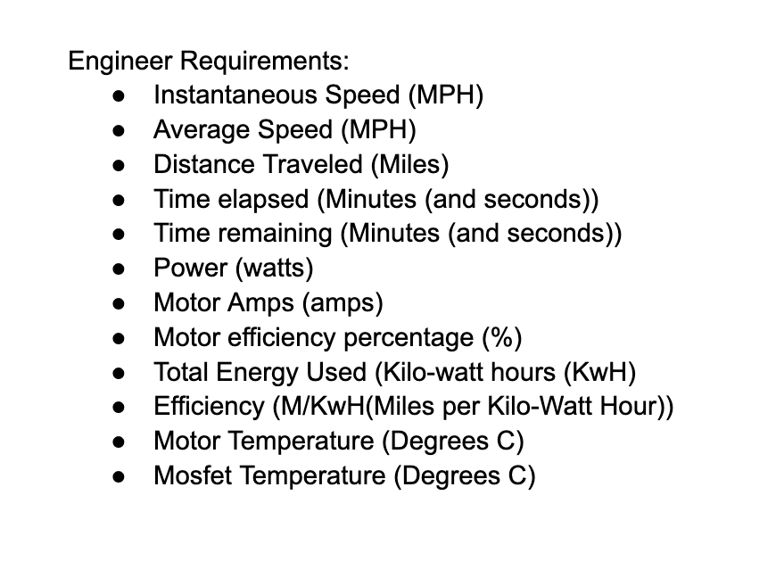
During this phase, I determined what data was relevant to the driver and what was only relevant to the engineers.


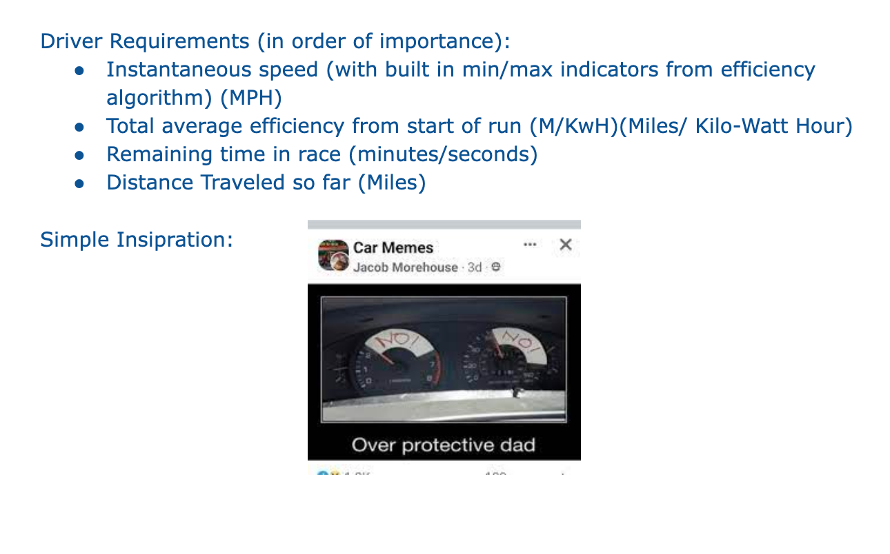
After the interviews, the most important data point for the driver was determined to be the current speed, with some sort of indication as to whether or not the current speed was efficient for energy usage. Previously, the efficiency indication was a colored rectangle (either red or green) in the top left corner of the screen.
Additionally, the driver would benefit from knowing the average efficiency for the trip, race time left, and distance traveled. Data from all the other sensors and calculations was only relevant to the engineering team.
With this information, I decided to design an icon and widget for each data point and give the interface two different viewing modes: driver and engineer. Each mode displays only the widgets pertinent to the specified user.
Here is the final design for the driver's view of the dashboard, only showing widgets with data points relevant to the driver during race time.
Results
I delivered the prototypes and assets to the software team who brought them to life in time for the 2023 Shell Ecomarathon competition. With the new dashboard, the car placed in the top ten teams had a nearly 50% increase in efficiency compared to the previous year's competition!
We continued to iterate on the dashboard and telemetry system, and were awarded 2nd place for best telemetry in 2024.